Guides · 6 min read
How consulting slides are structured
Strategy consulting firms have spent decades refining how a slide should work. The result is a simple, strict structure that any team can borrow: a title that states the point, one exhibit that proves it, and a storyline that holds together when you read only the titles.
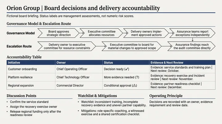
Why consulting slides look the way they do
Consulting decks are written for busy executives who may read them without the consultant in the room. Every slide has to make a clear claim, show the evidence, and fit into a larger argument. Decoration is kept to a minimum because it competes with the message.
The style can look dense at first, but it is very disciplined. Once you know the parts, you can read any consulting slide in seconds and build your own the same way.
Action titles: the most important line
An action title, sometimes called a headline or a takeaway title, is a full sentence at the top of the slide that states what the reader should conclude. Not Market overview, but The market is growing, but our share is falling in every region.
Good action titles share a few traits.
- They are a complete sentence with a verb.
- They state a conclusion, not a topic.
- They fit on one or two lines.
- They are specific, with numbers where you have them.
- Everything on the slide supports them, and nothing contradicts them.
The pyramid principle
Barbara Minto developed the pyramid principle while at McKinsey, and her book of the same name is still the standard reference. The idea is simple: start with the answer, then give the supporting arguments, then the evidence beneath each one.
Arguments under the same point should be grouped logically and should not overlap. Consultants often describe this with the MECE idea, mutually exclusive and collectively exhaustive, which is closely associated with Minto's work.
Minto also popularised the situation, complication, question and answer pattern for introductions. You describe the situation the audience already accepts, the complication that has changed things, the question that raises, and then your answer. It is a reliable way to open a deck.
One message per slide
Each slide makes one point. If you find yourself writing a title with and in the middle joining two separate ideas, you probably have two slides.
This rule is what lets the storyline work. Read the action titles of a well built deck in order and you get the whole argument, like the paragraphs of a short memo. Consultants often test a draft exactly this way, sometimes called the horizontal read, before worrying about any exhibit.
The vertical read is the other check: on a single slide, does everything below the title support that title? Remove anything that does not.
Anatomy of a consulting slide
Most consulting slides share the same building blocks, top to bottom.
- Tracker: a small label showing which section of the deck you are in.
- Action title: the one sentence conclusion.
- Subtitle or chart title: what the exhibit shows, with units.
- Exhibit: a chart, table, framework or diagram that proves the title.
- Callouts: short notes or highlights that point to the key part of the exhibit.
- Footnotes and source line: where the data came from and any caveats.
Choosing the right exhibit
The exhibit is the proof. Common choices include bar and line charts for comparisons and trends, waterfall charts for explaining how one number became another, two by two matrices for prioritising options, driver trees for breaking a metric into its causes, and comparison tables for weighing options against criteria.
Pick the exhibit that makes the title obviously true at a glance. Then highlight the part that matters, with a colour or a callout, so the reader does not have to search for it.
Sometimes a slide needs two exhibits, for example a chart on the left and the three implications on the right. That is fine as long as both serve the same title. When the two halves start telling different stories, split the slide.
Common mistakes
Even experienced teams slip into these habits under deadline pressure.
- Titles that describe the chart, such as Revenue by region, instead of saying what it shows.
- Titles so long they become a paragraph. Two lines is a sensible limit.
- Exhibits that prove something slightly different from the title.
- Missing sources, which makes careful readers doubt the numbers.
- Executive summaries that list topics rather than conclusions.
Building consulting slides faster
Writing action titles and designing exhibits by hand is time consuming, especially across a long deck. PPTlover writes a takeaway title for each slide and designs the exhibit beneath it, from matrices and waterfalls to comparison tables, in consulting styles such as Consulting Grid, Consulting Matrix and Executive Minimal.
Start from a report, your notes or a short brief, choose how much detail to keep, and export to PowerPoint (.pptx) with Editable text so you can sharpen the wording yourself. It is worth doing the horizontal read on the result, just as you would with any draft.